Button can a lot more than we expect. It can destroy a blog or attract a lot of visitors. So adding a awesome button sure look cool in your blog. Do you want to add an awesome button with CSS animation in blog-spot? then you got it, pal. This button creates a sassy animation when you hover the mouse pointer on to the button.
 |
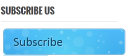
| Want to add an awesome button with CSS animation in blogspot |
The animation is slow but it will surely make the visitor click the button. This button is blue in color with mouse hover animation. You can change the color as ou like it. On mouse hover the bubbles will move inside like a gif image. It is so beautiful which visitors won’t resist to click it. You could add download as well as demo button by this CSS and HTML codes..
These codes are pure CSS and does not any java scripts that will reduce your webspge speed. So you can use it without any issue.
Just copy the below HTML code and add it above ]] skin tag
/**
* Name: SMT style
* Date: May 2014
* Autor: Akhil
* Version: 1
* Licence: shipmethis.com
**/ .awesome{font:15px Calibri, Arial, sans-serif;
text-shadow:1px 1px 0 rgba(255,255,255,0.4);
text-decoration:none !important;
white-space:nowrap;
display:inline-block;
vertical-align:baseline;
position:relative;
cursor:pointer;
padding:10px 20px;
background-repeat:no-repeat;
background-position:bottom left;
background-image:url(‘https://lh6.googleusercontent.com/-4cWMlF-uqh4/TltCfL8C4DI/AAAAAAAABhE/qNaNueMVpCU/s144/button_bg.png’);
background-position:bottom left, top right, 0 0, 0 0;
background-clip:border-box;
-moz-border-radius:8px;
-webkit-border-radius:8px;
border-radius:8px;
-moz-box-shadow:0 0 1px #fff inset;
-webkit-box-shadow:0 0 1px #fff inset;
box-shadow:0 0 1px #fff inset;
-webkit-transition:background-position 1s;
-moz-transition:background-position 1s;
transition:background-position 1s;
height:150;
width:200px;
font-size:25px;
}
.awesome:hover{
background-position:top left;
background-position:top left, bottom right, 0 0, 0 0;
}
.awesome:active{
bottom:-1px;
}
/* The three buttons sizes */
.awesome.big { font-size:30px;}
.awesome.medium { font-size:18px;}
.awesome.small { font-size:13px;}
/* BlueButton */
.awesome{
color:#0f4b6d !important;
border:1px solid #84acc3 !important;
background-color: #48b5f2;
background-image: url(‘https://lh6.googleusercontent.com/-4cWMlF-uqh4/TltCfL8C4DI/AAAAAAAABhE/qNaNueMVpCU/s144/button_bg.png’), url(‘https://lh6.googleusercontent.com/-4cWMlF-uqh4/TltCfL8C4DI/AAAAAAAABhE/qNaNueMVpCU/s144/button_bg.png’),
-moz-radial-gradient( center bottom, circle,
rgba(89,208,244,1) 0,rgba(89,208,244,0) 100px),
-moz-linear-gradient(#4fbbf7, #3faeeb);
background-image: url(‘https://lh6.googleusercontent.com/-4cWMlF-uqh4/TltCfL8C4DI/AAAAAAAABhE/qNaNueMVpCU/s144/button_bg.png’), url(‘https://lh6.googleusercontent.com/-4cWMlF-uqh4/TltCfL8C4DI/AAAAAAAABhE/qNaNueMVpCU/s144/button_bg.png’),
-webkit-gradient( radial, 50% 100%, 0, 50% 100%, 100,
from(rgba(89,208,244,1)), to(rgba(89,208,244,0))),
-webkit-gradient(linear, 0% 0%, 0% 100%, from(#4fbbf7), to(#3faeeb));
}
.awesome:hover{
background-color:#63c7fe;
background-image: url(‘https://lh6.googleusercontent.com/-4cWMlF-uqh4/TltCfL8C4DI/AAAAAAAABhE/qNaNueMVpCU/s144/button_bg.png’), url(‘https://lh6.googleusercontent.com/-4cWMlF-uqh4/TltCfL8C4DI/AAAAAAAABhE/qNaNueMVpCU/s144/button_bg.png’),
-moz-radial-gradient( center bottom, circle,
rgba(109,217,250,1) 0,rgba(109,217,250,0) 100px),
-moz-linear-gradient(#63c7fe, #58bef7);
background-image: url(‘https://lh6.googleusercontent.com/-4cWMlF-uqh4/TltCfL8C4DI/AAAAAAAABhE/qNaNueMVpCU/s144/button_bg.png’), url(‘https://lh6.googleusercontent.com/-4cWMlF-uqh4/TltCfL8C4DI/AAAAAAAABhE/qNaNueMVpCU/s144/button_bg.png’),
-webkit-gradient( radial, 50% 100%, 0, 50% 100%, 100,
from(rgba(109,217,250,1)), to(rgba(109,217,250,0))),
-webkit-gradient(linear, 0% 0%, 0% 100%, from(#63c7fe), to(#58bef7));
}/*
shipmethis.com———————————————– */
Add below HTML code to where you want the button to appear.
<a class=”awesome” href=”https://www.shipmethis.com” target=”_blank”>DOWNLOAD</a>
Change href=”https://www.shipmethis.com” to the URL of yours. You can add any links to this.
target=blank is used to open the link in new tab. You can remove it if you want the page to open in the same page itself.
You can edit the “DOWNLOAD” to any word according to the link.
Reference: http://downloads.templatesdoctor.com/2012/11/darkred-blogger-template.html
You can add the button in blog posts, gadgets and anywhere yo like. You can customize the image if you like by replacing image png.
Akhil S Kumar22-05-2014
